Command Editor
The Command Editor is the main route to creating your own buttons, hotkeys, User commands and other functions in Opus. There
are several variants of the command editor dialog used throughout the program,
although they all have the same basic design.


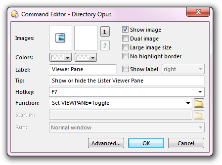
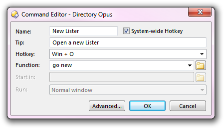
This screenshot shows two variations of the command editor. The one on
the left is the editor for a standard toolbar button - the function being edited
is the Viewer Pane command from the default toolbar. The one on
the right is the editor for the New
Lister hotkey.
- Images: When the command is displayed in a toolbar or a
drop-down menu, the image settings will be used to display an image for the
command. Hotkeys do not have images as they are never physically
displayed on screen.
- Images: The two Images fields let you
define up to two images for a button. The first image is the primary image;
it is the one most often displayed. If the Dual image
option is enabled, the second image field lets you define a
secondary image that's displayed when the mouse is over the button.
- Show image: Turn this on to enable the the button's
images. This may be overridden by settings defined for the toolbar - see
below for more details.
- Dual image: Turn this on to enable the secondary image
when the mouse is over the button.
- Large image size: Displays large images instead of
small. This may be overridden by settings defined for the toolbar - see
below for more details.
- No highlight border: The button won't have a border
(frame) when the mouse is over it.
- Colors: You can specify a text and background color for
the button that will override the normal colors for the toolbar. Hotkeys do
not have color fields.
- Label: When the Show label option is
turned on, the button's label will be displayed in the toolbar or menu. If the
button has an image as well you can choose the label's position relative to
the image - for example, selecting right will position the label to
the right of the image. This may be overridden by settings defined for the
toolbar - see below for more details.
If a button's label has an
ampersand (&) character before a letter, that letter will
be marked as a type of hotkey for that button. When the button is on the
top-level of a toolbar, pressing Alt plus that letter
activates the button. For example, the File menu's label is
actual set to &File - meaning you can press
Alt+F to open the File menu. If you want to use a literal
ampersand character in the label, you must use a double &
instead (e.g. Backup && Restore).
- Tip: This is a description of the command that's
displayed in a pop-up tooltip when you hover the mouse over the button. You
can insert a line break in the tooltip (and therefore split it to multiple
lines) using the \n sequence.
- Hotkey: This lets you assign a hotkey to the button.
Pressing the assigned key will activate the button's function as if you had
clicked it. The hotkey field is a special control designed to make it easy to
enter a key combination. Click in it to activate it like a normal string
field, and then simply press the desired key combination. For example, to
assign Ctrl+Shift+F2 to a function, click in the field and
press the Ctrl, Shift and
F2 keys together. The drop-down attached to the field lets
you select keys that you can't normally use in a dialog
(Escape, Tab, Enter).
There are two types of hotkeys; local and global. A
hotkey you define for a button in a Lister toolbar or menu is a local hotkey,
that works only when a Lister is the active window. Global hotkeys work
anywhere in the system (as long as Opus is running). By definition, hotkeys
defined for buttons in floating toolbars are global. The command editor for a
hotkey function (that is, a function that exists solely as a hotkey, rather
than a hotkey assigned to a toolbar button) lets you select the local or
global state using the System-wide Hotkey option. See the Hotkeys page for more information on
defining hotkeys.
If you assign a hotkey to a button that opens a
drop-down menu, pressing the hotkey will pop the menu open.
- Function: This is the actual function that the button
will run when it's activated. The screenshot above shows the dialog in
simple mode, where the function can only be a single line - there is
also an advanced mode which lets you have multiple-line functions.
The function can run an internal Opus command or an external program. See the
pages on both simple
and advanced mode
for more information on defining the function.
- Start in: When a command runs an external program, this
field specifies the folder that the program will start in (in other word's,
the new program's current directory). This field isn't used for internal Opus
commands.
- Run: When running an external program this lets you
specify how the program's window is to appear. You can choose from Normal
Window (the program itself defines the window size), Minimized
(the program will open minimized to the taskbar), Maximized (it
will open full screen) and Hidden (it won't show a window at all).
Not all programs will respect these settings. You need to be careful when
using Hidden as it can result in the program running without any
visible user interface - you should only use it when you know that's
definitely what you want. It's most useful when launching a DOS script that
runs and quickly exits, as it lets you hide the quick "flash" of the DOS
command prompt.
Some of the options in the command editor can be overridden by the settings
for the toolbar the button is in - the Show image,
Large image size and Show label options
can all be overridden by the options in the Images & Labels
setting on the Toolbars tab in the Customize dialog.
The Advanced button at the bottom lets you switch from simple to advanced mode.
