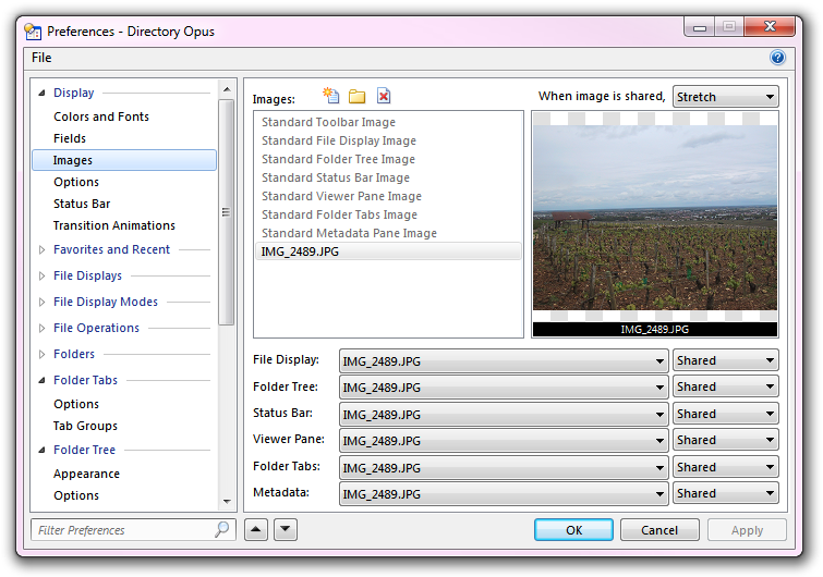
Images
You can use the Images page to define images that Opus will display instead
of a solid background color behind elements of the Lister. An image file on disk
(e.g. a JPEG file) has to be added to the list of Images in Preferences before
it is available for a Lister element to use. There are two types of
images in this list (although in practical terms they are the same):
- Standard images are placeholders for each of the elements
that can have an image assigned to it. Although no images are configured by
default, each element is set by default to use its standard image. For
example, the File Display is set by default to use the Standard File
Display Image. There are two reasons for this:
- To assign an image to a Lister element, generally all you need to do is
edit the standard image setting for that element.
- Lister Themes are able to
make changes to toolbar images without needing to know what toolbars you
have turned on (a theme can define an image for a specific toolbar, but you
may not have that toolbar turned on in your configuration - whereas, if all
toolbars are set to use the standard image, a theme is able to change them
automatically).
- User-added images are images that you have added to the
Images system yourself. These appear in the Images list and can be assigned to
any Lister element just like the Standard images.
Once an image file has been added to the list (or assigned to one of
the Standard image types) it can be assigned to one or more of the Lister
elements using the drop-downs at the bottom of the page. For each element, you
can specify how the image is used:
- Tiled: The image is tiled across the element; if it is
smaller than the dimensions of the element, it is repeated to fill the bounds
of the element
- Stretched: The image is stretched to the dimensions of
the element (either smaller or larger)
- Top/Left: The image is anchored to the top/left corner of
the element, and is clipped if it is larger than the element
- Top/Right: The image is anchored to the top/right corner
- Bottom/Left: The image is anchored to the bottom/left
corner
- Bottom/Right: The image is anchored to the bottom/right
corner
- Center: The image is centered within the element
- Shared: The image is shared with other elements across
the whole Lister

The screen shot above shows a image that has been added to the list, and set
to be Shared by all elements. When an image is set to be shared
by an element, the image is displayed relative to the whole Lister. In effect,
this lets you have one single image that is displayed behind the whole Lister,
rather than behind individual elements of the Lister. When an image is
shared the way it is drawn is governed by the setting for the When image
is shared drop-down at the top of the page - images can either be tiled
across the whole Lister, or stretched to fill the Lister completely, as in the
screen shot below:

Images for toolbars must be added to the list in Preferences like those for
other elements, but they are assigned to toolbars using the Customize dialog. You can also assign images to
specific folders using the Folder
Formats system - so for example, you could make any folders containing
mostly music files display a music symbol as a background image.


