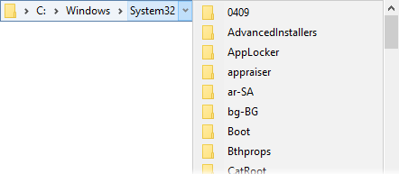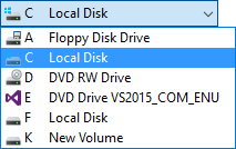
When drop-down menus are too big for the screen they now use a scrollbar (and support the mouse wheel) rather than the up / down arrows that previous versions of Opus used.
Drive Buttons on toolbars can now draw small drive letters over the icons themselves. This is done by default if the buttons are configured to show only icons and no labels, since otherwise you often end up with a line of identical icons with no way to distinguish them except by hovering the mouse over them to display their tooltip.
You can override this to force it on or off if you want, using the iconletterson and iconlettersoff keywords for the Go DRIVEBUTTONS command.
The Drives toolbar drop-down field can now display the drive’s label (as well as its letter), if you add the keyword labels to the button’s Args field.

Label fields in drop-down menus are now drawn in a bold font and left-aligned to stand out visually from the other items in the menu.
In Windows 10, Taskbar-style floating toolbars now mimic the look of the Windows 10 taskbar. The new style also looks better on Windows 8 and 8.1.
The @ifset and @icon directives can use the new RECYCLEBINEMPTY argument to test if the recycle bin is empty or not. For example,
@ifset:RECYCLEBINEMPTY
@confirm The recycle bin is empty!
@ifset:else
Delete EMPTYRECYCLE
Toolbar buttons that use @icon with RECYCLEBINEMPTY will refresh themselves automatically when the recycle bin state changes (this lets you have a button whose icon reflects the state of the recycle bin).
The new command Set THUMBNAILSIZE=list generates dynamic buttons that allow you to switch thumbnail sizes. The sizes it generates buttons for start with 32px and then double until the maximum size is reached (and the maximum size is determined by your system DPI).
The various components of the breadcrumbs path field that can have their sizes configured are now scaled for high DPI displays. For example, size=1+1+1+3+3 would equate to size=2+2+2+6+6 on a 200% DPI system. You can prevent scaling if you want by specifying negative numbers for the size; e.g. size=-1+-1+-1+-3+-3.
It’s always been possible to use the @disablenosel modifier to make your buttons disabled when no files are selected. The new modifier, @hidenosel, works just the same – except a button with this modifier will be hidden instead of disabled when no files are selected.
Both @disablenosel and @hidenosel can now check for files or folders matching a certain wildcard pattern being selected, rather than just “any files”. For example, @hidenosel:type=*.jpg would hide the button unless at least one .jpg file was selected. Normal pattern matching is supported.
You can also test for files or folders specifically (otherwise the pattern can match both). For example, @disablenosel:files,type=old* would disable the button unless files whose names begin with “old” are selected. @hidenosel:dirs would hide the button if no folders were selected.
The @ifset: directive allows you to test if a Set command condition is active (e.g. @ifset:TREE). While the Set command is the main command that uses context sensitive commands, a few other commands do too in some cases (e.g. the Show THUMBNAILSIZE command will “highlight” a button when the thumbnail size is set to the size specified in the command).
You can now use the more generalised @if: directive to test for those commands (it also works with Set as well). For example, @if:Set TREE is equivalent to @ifset:TREE. This will be mostly useful in the viewer now that the viewer toolbar is configurable. For example, a button in the viewer toolbar can test if the zoom mode is set to “fit” with the directive @if:Show VIEWERCMD=zoom,fit.
The script form of this test, Command.IsSet(), now takes an optional second argument which specifies the command to test against (and this defaults to “Set” if it’s not provided).