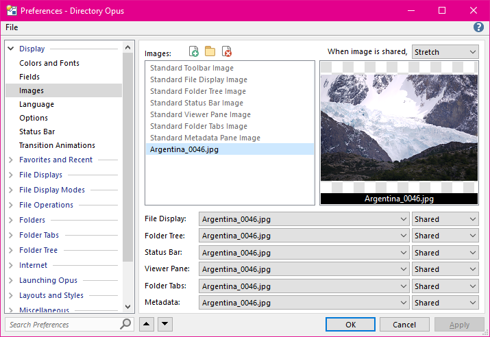
You can use the Images page to define images that Opus will display instead of a solid background color behind elements of the Lister. An image file on disk (e.g. a JPEG file) has to be added to the list of Images in Preferences before it is available for a Lister element to use. There are two types of images in this list (although in practical terms they are the same):
Images can be added, assigned or removed using the three buttons above the list, in the top half of the dialog. You may also drag & drop an image file to the list to add a new image, or to the thumbnail on the right to replace the currently selected image.
Once an image file has been added to the list (or assigned to one of the Standard image types) it can be assigned to one or more of the Lister elements using the drop-downs at the bottom of the page. For each element, you can specify how the image is used:

The screen shot above shows an image that has been added to the list, and set
to be Shared by all elements. When an image is set to be shared
by an element, the image is displayed relative to the whole Lister. In effect,
this lets you have one single image that is displayed behind the whole Lister,
rather than behind individual elements of the Lister. When an image is
shared the way it is drawn is governed by the setting for the When image
is shared drop-down at the top of the page - images can either be tiled
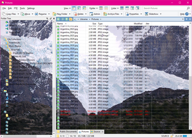
across the whole Lister, or stretched to fill the Lister completely, as in the
screen shot below:

Images for toolbars must be added to the list in Preferences like those for other elements, but they are assigned to toolbars using the Customize dialog. You can also assign images to specific folders using the Folder Formats system - so for example, you could make any folders containing mostly music files display a music symbol as a background image.