Toolbar Appearance
This page contains options that affect some aspects of the appearance of
toolbars and menus.
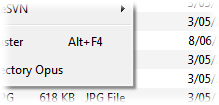
- Display drop shadow under menus: This options lets you
control whether drop-down (or pop-up) menus have a shadow underneath them or
not.


- Display toolbar top and bottom borders: This option
controls whether toolbars have a top and bottom border or not.


- Scale Toolbar button images: This option lets you control
whether images you use for toolbar buttons will be scaled to the "standard"
size if they are larger than the size set for the toolbar. The standard Opus
toolbar image sizes are 22x22 for small images and 32x32 for large images.
- Use Office 2003-style for toolbars: If this option is
enabled, Opus will draw toolbars and menus in a style inspired by Office 2003.
If turned off, toolbars will be drawn in the "normal style" for your OS
version.


If Office 2003-style
toolbars are enabled, you can configure the colors used when they are "hot" or
"active":
- Use custom button highlight colors: If this is enabled
you can completely configure the colors for all elements and states of the
toolbar. If disabled, most colors are generated automatically from the
options below.
- Highlight base color: This specifies the base highlight
color - the actual highlight is rendered using a gradient derived from this
color.
- Menu gradients: This specifies the gradient colors used
to fill the left-hand edge ("gutter") of drop-down menus.
- Horizontal button spacing: You can use this option to
increase the horizontal spacing between toolbar buttons.
- Vertical button spacing: You can use this option to
increase the vertical spacing between between toolbar buttons (it also
affects the padding at the top and bottom of toolbars).
You can configure the background color or images of toolbars from the Colors and Fonts and Images pages.


