Drop-down Buttons and Menus
A drop-down button is a special type of button that displays a menu. A menu
can contain one or more buttons, and these can themselves be drop-down buttons.
This lets you create cascading menus. There is no limit to how many levels of
drop-down menus you can create.
There are two different types of drop-down button:
- Menu: A drop-down menu is a button that displays a menu, and nothing
more.

Clicking the button makes the menu
appear.
- Menu Button: A drop-down menu button is like a regular button combined
with a menu.

A menu button has two distinct parts.
The larger part - labeled Rename in the above example - acts like a
regular button. It can have a function defined for it, and clicking the button
part runs the function.

The smaller
part - containing the arrow glyph - displays the drop-down menu. Clicking the
arrow part of the button drops the menu down.

Drop-down buttons are edited in Customize mode like any others - please see
the Editing the Toolbar
page for a complete description of how to edit buttons on the toolbar. There are
a few minor differences when dealing with drop-down buttons:
- You can convert from one type of drop-down button to the other, and back
again. Right-click the menu or menu button, and choose the
Convert command from the context menu. When you convert a
menu to a menu button, the first button from the menu becomes the "button"
part of the menu button. Going the other way, the "button" part of the menu
button becomes the first button in the menu.
- To edit a drop-down button, you must right-click the button and choose the
Edit command from the context menu - double-clicking the
button won't work.
- To edit the buttons inside the menu (for either type of drop-down button),
pop open the menu first by clicking the button once. Clicking the button again
will close the menu.
Drop-down buttons on the top-level of a toolbar respond to an ampersand
(&) character in their label. This can be used to mark a
letter of the button's label as a type of hotkey - pressing Alt
plus that letter will pop-open the menu, which lets you access its
contents using the keyboard.

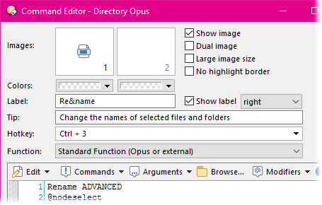
This screenshot shows the definition for the Rename menu
button on the default toolbar. You can see that the button's label is actually
set to Re&name - even though on the toolbar it displays as
Rename. The 'n' in the label has been marked by the ampersand, and this
lets you press Alt+N to pop open the drop-down attached to the
Rename button. The button also has a hotkey defined
(Ctrl+3) - this applies to the "button" part of the menu
button. Pressing Ctrl+3 runs the button's command (Rename
ADVANCED) - the same as if you click the "button" part and not the
drop-down.
If you want to use a literal ampersand in a button's label, you must use
a double & (e.g. Backup && Restore).


