Field buttons are another special type of button. They are used to place
field controls (for example, the location fields) on your toolbars. In Customize
mode they appear as a simple frame which you can resize by clicking and dragging
the border.

The above image shows the search field from the default Menu toolbar and the
location field from the default File Display Border toolbar. You can see that
the search field has grab handles at the right-hand edge, which let you resize
the field. The location field does not, because it is set to Full
Width mode, meaning it will expand to fill all available space on the
toolbar.
Once we leave Customize mode you can see that the frames revert to fully
functional fields:

Note that the compatibility files button disappeared when leaving Customize mode; this is because when the screenshot was taken the Lister was not currently displaying a folder that has compatibility files, and so the button was automatically hidden. You'll find that many buttons on Opus toolbars can change their state (checked or unchecked, enabled or disabled, hidden or shown) dynamically. If we had navigated to C:\Program Files before taking the screenshot the compatibility files button would have been visible.
Field buttons are the only type of button that you can't create manually (by
starting with a new button). To add a field button to a toolbar you have to find
its entry in the list on the Commands page and drag it to the
toolbar. Once it is on the toolbar, however, you can change what type of field
it is as well as configure certain properties by right-clicking it when in
Customize mode.

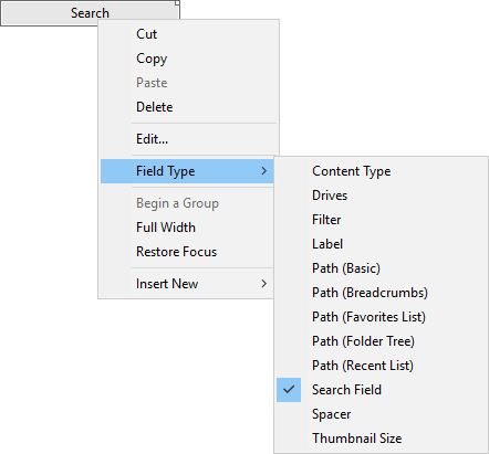
The context menu for a field button lets you configure two options that only apply to fields:
The Field Type sub-menu lets you switch between the various
types of field:


Label fields in drop-down menus are drawn in a bold font and left-aligned to stand out visually from the other items in the menu.


See the Editing The Toolbar section for more information on how to edit toolbar fields.