Field Buttons
Field buttons are another special type of button. They are used to place
field controls (for example, the location fields) on your toolbars. In Customize
mode they appear as a simple frame which you can resize by clicking and dragging
the border.

The above image shows the location and search fields from the default
location toolbar (with the compatibility files button nestling between
them). You can see that the search field has grab handles at the right-hand
edge, which let you resize the field. The location field does not, because it is
set to Full Width mode, meaning it will expand to fill all
available space on the toolbar.
Once we leave Customize mode you can see that the frames revert to fully
functional fields:

Note that the compatibility files button disappeared when leaving Customize
mode; this is because when the screenshot was taken the Lister was not currently
displaying a folder that has compatibility files, and so the button was
automatically hidden. You'll find that many buttons on Opus toolbars can change
their state (checked or unchecked, enabled or disabled, hidden or shown)
dynamically. If we had navigated to C:\Program Files before taking the
screenshot the compatibility files button would have been visible.
Field buttons are the only type of button that you can't create manually (by
starting with a new button). To add a field button to a toolbar you have to find
its entry in the list on the Commands page and drag it to the
toolbar. Once it is on the toolbar, however, you can change what type of field
it is as well as configure certain properties by right-clicking it when in
Customize mode.

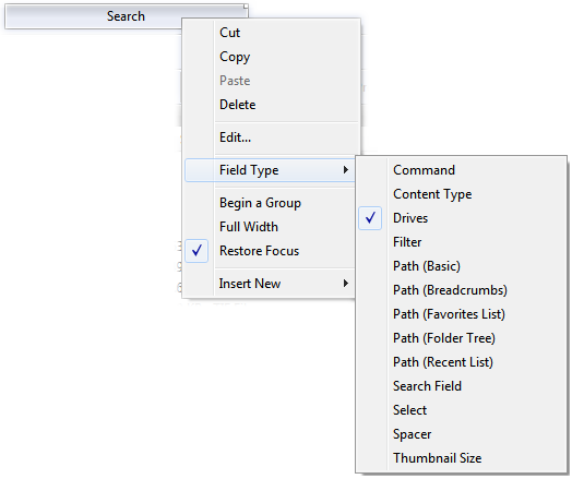
The context menu for a field button lets you configure two options that only
apply to fields:
- Full Width: If this option is enabled, the field will use
all the available space on the toolbar (that is, any space that's not used by
another button). If two or more fields on the same toolbar have this flag set,
they will share the available space.
- Restore Focus: If this option is enabled, pressing the
Enter key in the field will return focus automatically to the
file display.
The Field Type sub-menu lets you switch between the various
types of field:
- Command: A field that you can type an internal or
external command into to run it in the current Lister. Very similar to
the command mode of the find-as-you-type field.

- Content Type: If folder content type detection is enabled, displays the
current content type format in use. You can also use the drop-down list to
instantly switch to one of the defined content type formats.

- Drives: The Drive List field is drop-down list of
your disk drives. Selecting a drive from the list navigates the source file
display to that location.

- Filter: The filter field lets you filter the items
visible in the current folder by entering a wildcard pattern.

- Path (Basic): The basic path (location) field is
a minimalist text field that displays the current path and lets you type
a new path to navigate in the Lister. By default this field controls the
current source file display, but you can configure it to specify the display it
is linked to.

- Path (Breadcrumbs): The breadcrumbs path (location) field is
a powerful navigation tool that provides instant access to prior locations in
the current path. This field has lots of configurable options that can
modify its appearance and behaviour.

- Path (Favorites List): The favorites list path field
combines the basic path field with a drop-down menu of your favorite folders, which you can
navigate to by selecting them from the drop-down. By default this field
controls the current source file display, but you can configure it to specify the display it
is linked to.

- Path (Folder Tree): The folder tree path field combines
the basic path field with a drop-down list containing the folder tree
hierarchy leading to the current location. This lets you navigate to previous
folders in the tree from the drop-down. By default this field controls the
current source file display, but you can configure it to specify the display it
is linked to.

- Path (Recent List): The recent list path field combines
the basic path field with a drop-down menu of your recently visited folders. By default
this field controls the current source file display, but you can configure it to
specify the display it is linked to.

- Search Field: The search field lets you search the
current folder using the indexed Windows Search system.

- Select: The select field lets you select files and
folders in the current folder by entering a wildcard pattern.

- Spacer: A spacer field has no function other than to take
up room on the toolbar - it's used to right-justify toolbar elements.
- Thumbnail Size: The thumbnail size field lets you
dynamically resize thumbnails in the current folder. It will be hidden when
the Lister is not in thumbnail mode.

By default the slider will set
the thumbnail size using the aspect ratio configured in Preferences, however
if you edit the underlying command and add the keyword
preserve to the Args field, it will preserve the
current aspect ratio (this would only be useful if the aspect ratio has been
changed manually using the Set THUMBNAILSIZE
command).
See the Editing The
Toolbar section for more information on how to edit toolbar fields.


