The Lister
Listers are what you might call the Opus "main window" - in a traditional
file manager, they would be the main (or only) window. The name Lister derives
from the original Opus on the Amiga computer (20 years ago!). Listers were much
simpler then, doing nothing much more than displaying a list of files and
folders - and what do you call something that lists things? A
lister!
These days the Opus Lister contains multiple configurable user-interface
elements that let you access various program functionality. At their core though
they still display lists of files and folders, and indeed this is the only
functionality of a Lister that can't be disabled.

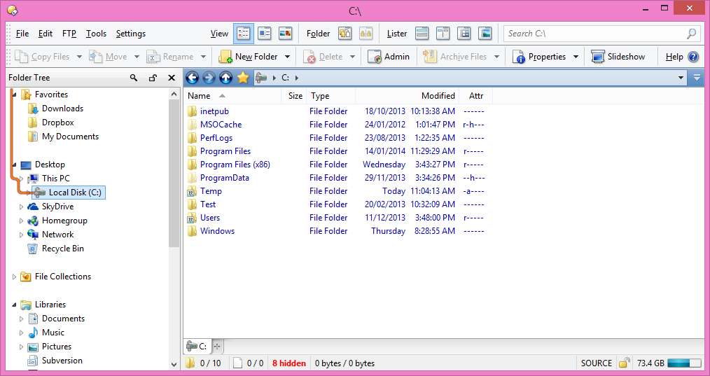
Above is a screenshot of a fairly simple Lister using the default Opus
configuration. The two default toolbars are visible at the top of the
Lister, then below this are the folder tree (on the left), and the
file display on the right. The file display has a third toolbar at the
top of it. The folder tree indicates that drive C: has been selected and indeed,
you can see that the contents of drive C: are shown in the file display to the
right of the tree. Note the folder tab displayed at the bottom of the
file display - currently, only one tab is open (the one showing C:) but you can
open as many folders as you like each in their own tab, and rapidly switch
between them.
At the bottom of the file display is the status bar, which
displays some summary information about the folder shown in the file display.
The information displayed on the status bar can be configured through the
Preferences system.
You might think from that image that a Lister is basically the same as
Explorer - in which case, what's the point of Opus? In fact, Opus has been
deliberately designed to resemble Explorer in its default configuration. This
provides a sense of familiarity for new users first switching from Explorer - if
you've used Explorer before you can instantly start using Opus in the same way,
and learn more about its additional functionality and configurability as you
go.

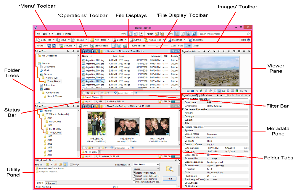
This screenshot illustrates a much more complex Lister, and immediately you
can see that the resemblance to Explorer is only superficial. The key user
interface elements visible in this screenshot are:
- File Displays: The core element of the Lister, the file
display lets you see the contents of the current folder. You can choose how
files and folders are arranged (both sorting and grouping can be configured),
and you can use filters to hide or show certain files
or types of files. Most actions (like copying / deleting files, creating
folders, adding to archives, etc) take place within the file displays. Listers
can display either one or two file displays simultaneously, and each file
display can have one or more tabs,
each of which can display the contents of a different folder. Each file
display has a configurable toolbar displayed above it that shows the current
location and provides basic navigation buttons. There are a number of options
in Preferences that affect the appearance and behaviour of file displays (for
example, you can have grid lines shown, enable full-row selection mode, etc).
See the File
Displays and File Display Modes
categories in Preferences for more information.
- Default Toolbars: The Menu and Operations toolbars
are the default set of
toolbars built-in to Opus. These toolbars can be turned on or off, and
edited, but they can't be deleted or renamed - and you can easily reset
them to their defaults at any time. Also shown above is the default Images
toolbar, which is displayed whenever a file display is set to thumbnails
mode. Of course you can create
your own toolbars with any combination of buttons that you like - many
people turn off the default toolbars as soon as they install Opus and never
look at them again!
- Folder Trees: The folder tree displays the folder hierarchy that
leads to the currently selected folder. You can turn the folder trees on or
off, and in a dual display Lister, you can choose to have a separate folder
tree for each file display, or a single folder tree that is shared between
them. Folder Trees can be both a navigational tool (clicking on a new folder
in the tree will display its contents in the file display), and as a target
for file operations (e.g. you can drag a file from the file display and drop
it on another folder in the tree to copy or move it).
- Viewer Pane: The Viewer pane displays the contents of the
selected file. Opus supports dozens of different image and movie file formats
natively, and also has a viewer plugin system that lets third-party developers
write viewers for unsupported file types. Additionally, Opus ships with a
viewer plugin that leverages ActiveX technology to display files like Office
and PDF documents.
- Utility Panel: This is a multi-facted panel that provides
access to several utility
features, including Find (search for files and folders, based
on definable criteria), Synchronize (synchronize the contents of
one drive or folder, including remote FTP sites, with another) and Duplicate Files (search
for any files that are duplicated, or for duplicates of specific files).
Additionally, the Utility Panel is used to display several logs including the
file operations log, the FTP activity log and script output.
- Metadata Pane: This pane lets you view and edit the metadata for the selected file
or files. Many different image, music and document file types are supported.
- Status Bar: Displays statistics on the current folder,
including total number of files, files hidden by filters, free space on the
drive and more. You can configure what information is displayed through
Preferences.
- Filter Bar: Provides quick access to filename filters,
letting you control which files are
shown or hidden in the folder.
- Folder Tabs: Using Folder Tabs you can open multiple folders at the same time
and easily switch between them.
